Pick your pottery | #033
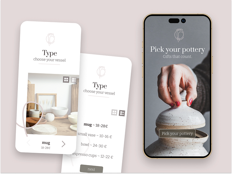
A quick design for a "customizable product" as a part of the #dailyui challenge (nr. 033) - I picked pottery because ceramics and pottery is a beautiful craft, that needs to be cherished and appreciated more.
Layout
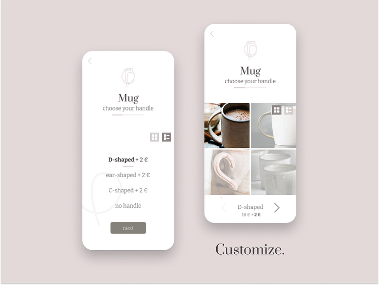
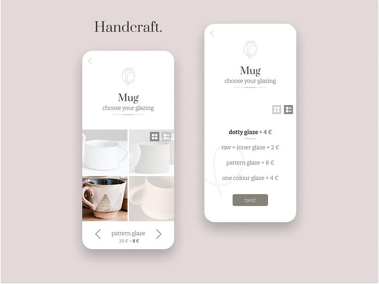
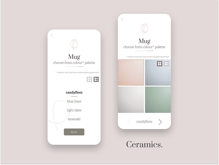
» Keeping the picking-options simple, clean and easy to follow
Logo
» I wanted to keep the 'imperfect'-ness of handcrafted pottery and hide the two "P"s of pick and pottery
Fonts
» Prata & Bitter for a gallant and classy look and feel
Colours
» Pastel colour palette that symbolizes the warmth of clay and conveys a 'cosy' atmosphere
Thank you for checking out my work ♥