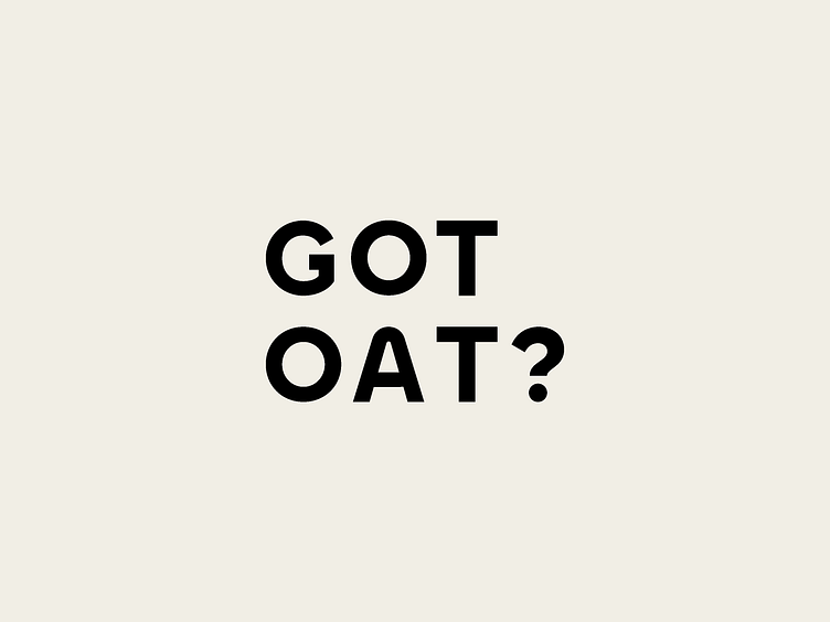
Got Oat?
Got Oat's design is a thoughtful composition that embodies the brand's values.
Minimalistic Logo: Got Oat's stacked text-only logo exudes simplicity and elegance. The aligned letters create a harmonious visual balance, representing precision and quality. The minimalistic design ensures recognition and leaves a lasting impression.
Iconography for Values: Iconography is strategically used to promote veganism and sustainability. Thoughtfully crafted buttons with simple yet impactful symbols reinforce the brand's values, resonating with the target audience.
Standard, Deluxe, and Endurance Versions: Distinct design approaches differentiate product variations. The standard version maintains a clean aesthetic, emphasising the brand's core values. The deluxe version features a black and gold colour scheme, evoking a sense of luxury. The endurance version, in calming blue, aligns with added nutritional benefits.


