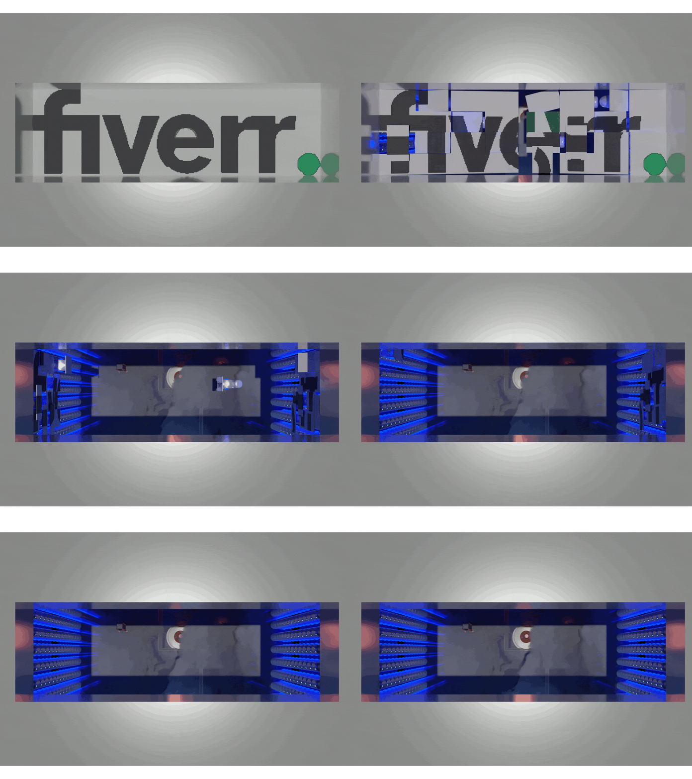
Fiverr logo transformation
This was supposed to be quite simple with tiling of the logo and having all of them rotate 180 degrees where the logo would be in reverse. But the rotation gave me portal vibes and I decided to go a bit further and added simple arms to hold the tiles. And made the lower grounds with the smoke, just to give a feeling of an endless pit with more tiles everywhere.
I gave each of the tiles some animation to make it seem a bit transformer-ish.
The logo I imported was quite low in resolution (therefore the blocky edges), so I wanted to push towards that direction to integrate it.
To do that I made one of the tiles fall from being hit by another tile. The falling tile then glitches, insinuating that they are screens, therefore the blocky edges.
I also added to each of the opening panels a slight "anticipation" before they're transported out of frame.
1 thing I would do different is make the tile hitting the falling tile, more visible. I would make it longer and seem like it really slammed into it before it falls.
Fiver logo mixed with some portal inspiration. Made for my logo animation Fiverr gig.
Check it out here. Link: https://www.fiverr.com/share/21PLWe
