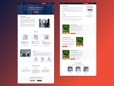
Design Case Study: Business Advisor
About Project: An agency for legal services to businesses.
Design Link to the project: https://www.figma.com/file/4DXNl0YdGB9Ky1O42Ds4aD/Legal-Services-%2F-Site-Design-(Copy)?node-id=73%3A545&t=v0XTDdFv5oH2dzvx-1
Case: We needed to create a website for businesses who can apply to us for the following services: 1) Registering a Company 2) Opening Bank Accounts 3) Trademarking.
The main goal for us was to gain the trust of our customers and bring the best experience.
Problem: We needed to stand out from our competitors and give the best experience to our users;
Make and easy navigation throughout the website.
Make the content easier to scan visually.
Highlight most important pages.
Gain trust of customers.
Prove the expertise of our specialists.
Highlite call to actions throughout the website.
Solution: I offered the following solutions for the mentioned above problems;
Provided an easy flow from home page | header | footer to all other pages and created the connection between all other pages by call to actions and ad banners.
Compared to competitor websites I created few but most important pages and seperated them logically so as users can understand where they are, what they need to do, and how they need to do.
All important pages highligted in main navigation.
Included different trust elements (reviews, testimonials, etc) throughout the website.
Provided a content explaining our experience.
Throughout the website all pages are full of CTAs.
_ _ _ _ _ _ _ _ _ _
Contac Info: Linkedin | Facebook | Instagram | Twitter
For collaboration reach me out at victoryhovsepyan@gmail.com
