OneLook
OneLook – one step closer to feeling better
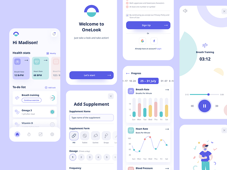
One Look is a concept for a mobile wellness app focused on improving health parameters and general well-being. Its main feature is a the daily to-do list where users can add activities and supplements.
The full UI Kit is available for free at Figma Community. Just copy and use it!
The product concept was created with my teammate Roksana Kobyłecka, who is also responsible for user flows.
Tailor set of illustrations
Custom-made illustrations can really make a difference and add a unique look to a product. I crafted illustrations for onboarding flow, success, and alert screens.
Exercise screens
In this product, users can add activities and measure time and key parameters as they are performed.
Adding new task flows
The flow of adding a new task to your daily to-do list is simplified in a single screen with all options included – with different choices for supplements and activities.
Statistics to show progress
The improvement of the users’ wellbeing is the main goal of this product. To make it easier to observe, I designed several types of charts illustrating various health parameters.
Design System
A clean design system prepared to be expanded through product growth helps the whole product team work faster and more effectively. You can download it from the Figma Community and use it freely to learn, practice or use it as a base to build your own product.
Let's collaborate hello@tooploox.com
Hope you have enjoyed this short case study!
Press ( L ) if you like it 💜
◗ ⬥ ● ■ ▲
tooploox.com ⬩ Behance ⬩ Linkedin ⬩ Instagram


