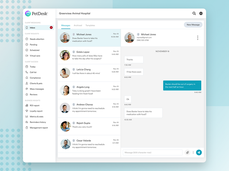
Two Way Messaging Feature
Introduction
One of the most critical issues that veterinary clinics face is the often overwhelming volume of phone calls from clients. Over time, these minutes on the phone accumulate and ultimately take away from the practice manager and staff attending to the pet parents and pets in the office. Our clients were in serious need of a way to make communicating with their clients more efficient.
We spent a few days talking to some of our customers to understand their current client communication processes, their biggest pain points, and how we might be able to alleviate some of their biggest issues. After speaking with these customers, it became clear that a two way messaging platform would be the ideal solution to improve their workflows.
Prioritizing features
After speaking with customers, I collaborated with product management to prioritize potential features and engineering to get a rough t-shirt sizing on these features. We determined that the product should include these features for the first phase:
Ability to send text, images and videos
Ability to search up clients by name or phone number to create a conversation
Ability to create and send templated messages
Ability to create a auto-response message that would be sent during closed hours
Ability to archive conversations
Ability to block numbers
With these features in mind, it was time to start the brainstorming process.
Personas
Initial Concepts
As a team we ran through a workshop to quickly brainstorm on different ideas and quick flows. We mainly focused on how we wanted the layout of this messenger to look and took inspiration from a variety of other messenger platforms.
Here's a preview of what this looked like:
We were quickly able to eliminate having the messenger in bottom right because it clashed with our customer support chat button that lived in that location.
After collecting feedback from customers, we were able to gather that users strongly preferred to have a full page view because the alternate treatment felt too condensed. Users wanted a lot of breathing room in the layout to be able to view message history and the current conversation without having to open and close different windows.
With this feedback in mind in was time to refine the design and hand it off to the engineering team.
Architecture
Final Result
To date, over 2,600 customers use the two way messaging product. This product has been huge in optimizing customer communication workflows for clinics and continues to be a major selling point for our sales team when speaking with prospective customers about their digital workflow solutions.
Next steps
Collect and synthesize feedback on the product by communicating with users.
Explore additional features that customers want.
Explore a mobile view solution.


