World Happiness Survey: Data Visualization
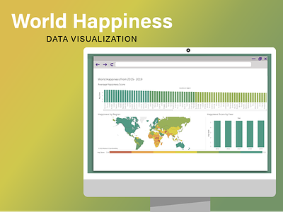
Tableau Dashboard
Data
This visualization was created based on the data collected from the World Happiness Report, found on Kaggle. The concept of scoring happiness based on a few categories was intriguing and I assumed would be interesting to visualize. The data came in separate excel sheets based on the years (e.g. 2015 - 2019). I combined all of the data into one sheet or CSV for ease of use. The basic overview of each variable was written out in the original data source, so not much analysis was needed. I did check the variables to see their true meaning in relation to the happiness score. The variables do not add up to the overall happiness score, nor do they add up to the same amounts across all ranks. The only conclusion I can draw from this is that they must be weights individuals placed on categories in their scores when surveyed. I left these variables out of the visualization in order to avoid confusion and misinformation for the viewer.
Audience
This visualization is very much for the passive audience or researchers looking to extract more information from the data. I imagine it would be shown on the Gallup World Happiness Report webpage. This data does not have a call to action. It is more of the informative type. It could be for the general public, but in an article that someone would lazily read on the train on the way to work, not something that sparks a fire to go protest. Since it is directed toward a researcher or someone specifically looking for more information on the World Happiness Report, I tried to show the data in multiple ways, such as the world map and the bar chart. Looking at the world map, you see general regions of the world where happiness might be higher than others, but then focusing on more, you can see more specifics on the values of happiness and which is higher than others.
Visualization Choices
This visualization shows the average happiness in any given year in a line graph, a regional map with the average happiness broken up into 7 colored segments of increasing happiness, and a bar graph showing average happiness per country or region. Every pane in the dashboard is clickable and doing so allows you to filter on that field. The year graph is at the top to illustrate what year exactly we are looking at in the world. From there, the user looks down into the world chart and sees that some regions or continents are happier than others. They can see a correlation between neighboring countries and their happiness. Finally, the viewer can look over at the bar graph to really hone in on the values of each country to find the difference within each different color segment. The color choices were made in order to show a clear connection between the bar graph and the world map. The user may also hover on any part of any pane in the dashboard and it will show the average happiness, region, and year that they are seeing. The year was intentionally added to the region and bar charts so the user did not have to dart their eyes back and forth between the current chart and the year line graph. Other visualizations that were considered were a dot graph for the year chart, but that seemed to convey time less than a line graph. A stacked bar chart was also considered instead of the average happiness single bar graph. The stacks would be each year. However, since the user is able to interact with the dashboard and filter on the year, it did not seem necessary. There are many takeaways the user can get from this dashboard, but I believe the obvious one is that countries close to one another seem to have similar happiness levels.
