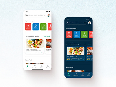
Light and Dark modes - Home screen for food ordering mobile app
Hey guys. I thought to share some snippets from my food ordering mobile app UI design: light and dark modes.
The "Explore Categories" section is my favorite as it makes selection easier for the user.
What do you think?
Leave a like and/or comment
More by Anthony Chukwu (UI/UX Designer) View profile
Like
