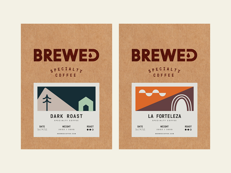
Branding for Brewed Coffee ☕
The logo and the secondary marks represent the bravery and boldness of the brand💪🏻. The font's affirmative feel creates a strong belief in the joyous taste of coffee☕. To create a greater association with the coffee, we have added a drop 💧highlight for the "D" letter at the end. This way, the logo isn't a simple and bold logotype, but one with a point and a message to send📮.
A strong and vibrant colour palette🎨 creates both comforting and warming feelings🫠, and that’s what coffee can truly give to people, especially when winter is slowly taking over with its coldness❄️. At the same time, we didn't want to create an overcrowded look on the packaging, which is why we used miniature illustrations🖌️ on the colourful packages and vibrant minimal illustrations on the neutral background.


