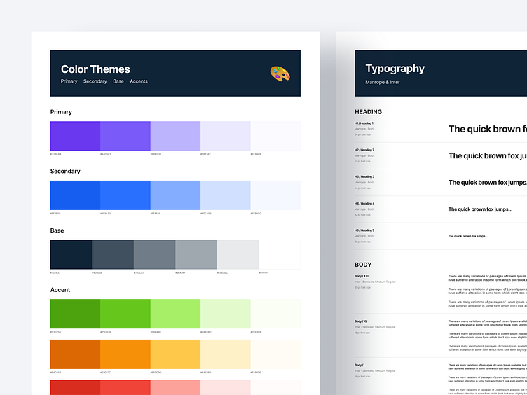
Typefaces and Colors for eCommerce web Design's Design system
Question for today:
What should you do if you begin working on a new project and discover that everything is disorganised?
I had the privilege of working on a website project last year and managing the visual design and design system (which didn't exist at the time). I'd want to briefly describe how I went about doing that and what I was able to accomplish.
What should be done to add value as quickly as possible?
start with the foundations.
The website attempted to employ its really cool brand book but did so inconsistently and without a more comprehensive approach. I was attempting to address that issue by bringing the first iteration of the design system to life in between creating images for new features and reworking existing ones.
And when it comes to the foundations, colors are the lightest. I developed a system for layering new hues and tones on top of the brand's basic colors. A few hex codes' implementations was merely a formality.
How can a large, already-existing website introduce new typography?
Eliminate obstacles and simplify what you can.
The colors were simple, but then I had to confront a boss battle. There were no established typographic guidelines, a ton of texts that were hard-coded, and no style uniformity. To keep the current design from breaking too much, I had to identify the values that frequently repeat and combine them.
Therefore, for each website breakpoint, I integrated dozens of words that were more or less unique into about 15 styles, including headings, paragraphs, and special styles. We will save the details of how we achieved it for another time.


