Regal Airlines
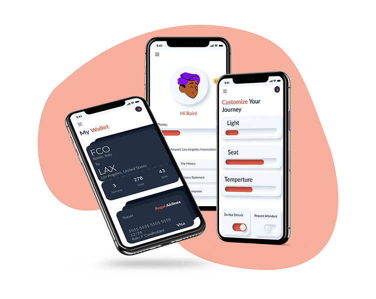
Regal Airlines is an all-inclusive flight companion app helping the flyer stay organized and relaxed from pre-board, to in-flight, to landing at their destination.
Regal Airlines was an individually completed bootcamp project inspired by spark prompt generator. The idea behind creating this project was to combine the aesthetic functionality, design, and navigational ease of luxury airline apps with features that better cater to the average flyer.
Problem
Many of our users reported feeling overwhelmingly stressed, anxious, and disorganized during their flying experience with expressed want for luxury, relaxation, and ease.
Solution
The goal of this product is to utilize technology to ease the travel experience with an all-inclusive app that meets all of our users’ travel needs through aiding them in organization allowing them to focus on relaxation instead of stress.
Tools
Figma
Team
1 UX designer
My Role
UX design
UX research
Project manager
Timeline
Overall: 3 weeks
Personas
I conducted two full usability studies, one at the low fidelity prototype stage and one at the high fidelity prototype stage. I conducted this research using a diverse sample pool consisting of users of various backgrounds, demographic information, and technological abilities to receive an accurate representation of the product’s success in the hands of the real users.
Wireframes & Low-Fidelity Prototype
From the research I gathered the users’ primary goal translated aesthetically to minimalism and simplicity which led to repetitive straightforward designs, the heavy utilization of negative space, and repetitive formatting.
I carried these design themes into the mainframes of the app keeping content minimal and using basic repetitive shapes to give the page a minimalistic look and ease the user experience. Keeping the app simple and easy to use prompts a more relaxed and enjoyable user experience.
Usability Testing
I created a fully-functional, low and high-fidelity prototype of the new flows using Figma. At the same time, I started recruiting subjects for the test who fit our criteria. I did 5 usability tests in the first round and 5 after iterating on the issues that I have identified:
User Testing 1
Simplistic design
User priority is efficiency
Keep icons, flow, and copy clear
User Testing 2
Standardize all components
Users valued minimalism
Users responded well to concise design choices
UI Design
Once the usability issues were resolved, I moved on to design the final screens in Figma. My goal was to create a visual style that communicates a clear brand identity that is present across all screens.
UI Design
Once the usability issues were resolved, I moved on to design the final screens in Figma. My goal was to create a visual style that communicates a clear brand identity that is present across all screens.
Impact
Technology can be used to enhance and add luxury to the flying experience while being efficient, minimalistic, and practical. We found through testing that users believe our product will enhance their flying experience, decrease stress, and heighten relaxation.
Next Steps
1
Receive feedback from more designers, researchers, and other professionals.
2
Test the product against a larger and more diverse sample size than I was able to do with my limited resources.
3
Iterate on the design based on user and peer feedback.
Learnings
Minimalism, simplicity, and detail-orientation are key components when designing a product for the core reason of usability and efficiency. Through this project I also learned how to communicate brand identity through the visual and interaction design of a given product to create a cohesive and consistent user experience.
Thank you for reading my case study!
Want to work with me? Feel free to contact me!...or just say hello at my email riverweisss@gmail.com


