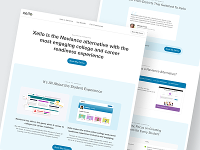
College and Career Readiness Software Landing Page
Hello Dribbblers! 👋🏻
Really excited to share this project with you.
For the past few months I have been working closely with the marketing team on the re-design of the Xello vs Naviance comparison page.
This page is a one-stop-shop directly comparing Xello's most compelling features and benefits, namely our student and educator experience.
This project was the first webpage designed entirely in Figma as we recently transitioned over from Sketch. There was a bit of a learning curve at first, but by the end of the project I can confidently say designing in Figma is a much better experience thanks to autolayout, components and libraries!
You can see the live version here.
More by Vanessa Townsend View profile
Like
