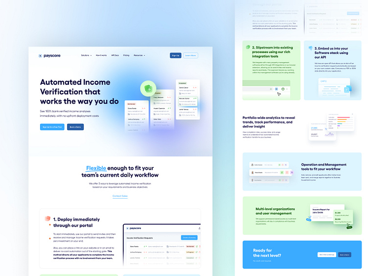
Payscore | Saas Landing & Webflow
Summary
Payscore - Automated Income Verification for Property Managers and Lenders.
The company wanted to create a new & more efficient website to replace the old one.
The previous website was based on an old template resulting in low usability, poor conversion & lack of all necessary functions. So, I decided to develop an appealing and functional website that would require less time to maintain, be more user-friendly, and increase user trust.
Problem
Why redesign the old website?
Payscore wanted to rebrand with new names and look&feel, they wanted to show that their technology is innovative and modern, when their website and brand looked outdated;
The complicated customer journey map
Low conversion rate
No personalized approach for customers
Bad website navigation
Hard to compare different approaches for lenders and customers;
Goals
/01
Create a Responsive Website
I aimed to create a well-thought-out responsive web design to deliver a fast-loading experience on all devices. As well, I need to develop an easy, clean, and fast website on Webflow.
/02
Impress with Efficient UX/UI Design
I strived to provide stunning UX/UI solutions within a simple yet effective website design. My task was to design a visual identity highlighting Payscore's unique value proposition. I wanted to create a playful friendly design but still professional and expressive.
/03
Deliver Conversion-Focused Design
I improved the conversion rate of the website via call-to-action buttons, logical structure, advanced search functionality, comfortable menus & much more.
Graphics
I wanted to reach the balance between well-thought content and expressive graphics that shows the idea of functionality.
Finally, I created equally expressive and straightforward graphics style, building on with clean structure and soft shadows, it reflect innovation future style of Payscore technologies.
The solution
After extensive research, workshops, and proposals, I crafted a comprehensive rebrand with a new visual identity and strategy. I changed the Payscore's brand in a clear statement to communicate to customers and investors. I created new website guidelines that included visual identity best practices, messaging strategy, and rich graphics, to achieve the new goals.
Icons
The innovative and playful style was accomplished with glass-styled icons.
Grid
Columns: 12; Gutter: 40px; Width: 80px;
Client Review
"Arina analyzed what we need and provided us with a design of an innovative, functional & user-friendly website, good job 👍"


