SAVR Recipes
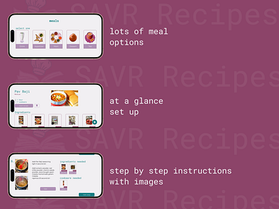
What is in the image
home screen, recipe screen, and instruction step screen
Summary of project ask
For the average person, time, ingredients, and experience are all factors that come into play when planning for their post-work dinner. While users do want to get their hands dirty, they find it difficult to navigate through recipe instructions. What’s most stressful is understanding the terminology that is associated with new cuisines. Straightforwardness, understanding, and a seamless integration of a digital recipe to the physical ingredient is the sought after problem.
One not so surprising insight I found was the need for validation- in general, people wanted a second eye that they have the correct ingredients and the meal is in the correct state. One surprising insight I found was the frustration in navigating between what can often be a messy process to the phone to keep track of next steps. A few other insights are the feeling of discouragement when things go awry and the annoying inefficient advance preparation to limit wait time.
Prototype
https://www.figma.com/proto/o03t2KF4ZfiUuNgeQ2Sub2/SAVR-Recipe?page-id=154%3A24652&node-id=154%3A26923&viewport=212%2C-2458%2C0.26&scaling=scale-down&starting-point-node-id=154%3A26923
Case Study
https://docs.google.com/document/d/1GZg6NbpQV_aEWqfZHYVtmoRsa6IwW42XMXwRNNyUu2c/edit?usp=sharing
