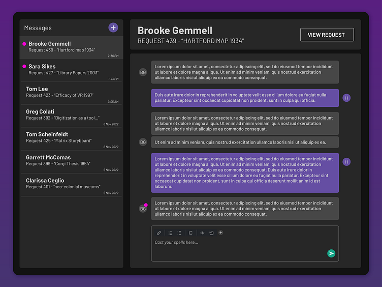
Message Interface Prototype
The goal for this design was to create an interface that combined instant messaging, email, and forum features for a mobile web app that streamlines the reference scan request workflow for undigitized archival documents. The users of this app are archivists, librarians, and researchers. Messages are on a per-request basis. The "View Request" button enables users to refer directly to the submitted request. Unread messages are signified by the pink dot.
Previous Chat Interface
I sent out a UX survey and received feedback on our chat interface such as:
"I would really encourage getting rid of the chat box and instead have a larger more stable messaging platform."
From additional conversations, I found that fulfillers were concerned that this interface seemed too much like an instant chat that was monitored 24/7. Additionally, users wanted to be able to see information on the request they were fulfilling. After hearing that, we discussed ideas of an interface that played off of the UI elements of Outlook Inbox, forums, and Slack. These design choices allowed users to feel familiarity with the chat interface, see the request while they were chatting, and have a more professional, human-to-human interaction.
Rather than a pop-up chat window, the communication feature now has its own page with the ability to see all conversations occurring. The new interface also allows users to view the communication thread and the request information side by side. Similarly, the fulfiller can access the activity log and internal notes in the same screen.


