Caribe & Co: logo + packaging
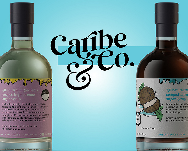
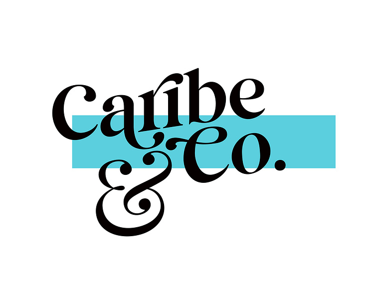
New products are exciting but working with a new brand as well, it doesn’t get much better than that for a brand designer! First and foremost, while working with Caribe&Co’s founder, we started brainstorming some logo concepts. Working through how she wanted the brand to fit within traditional Caribbean esthetics without being overly cliche and a clean/modern appeal sounded like a challenge I was up for. After cycling through many font styles, spacing, layout of some additional elements and colors, we finally landed on a fabulous match to what she was looking for.
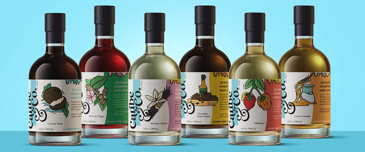
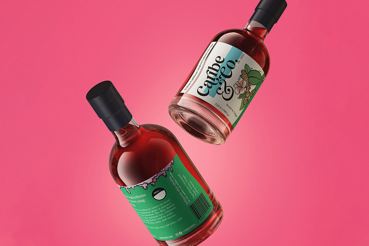
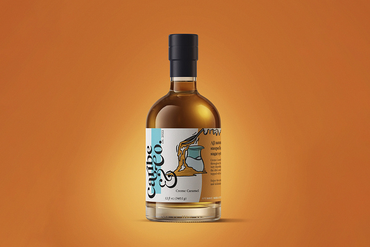
Next was the label! Taking into consideration the direction many Caribbean culinary brands take they labels, I put a modern and refined spin on it. Illustrating each flavor icon myself, I drew up images that were real enough to be mature, but they were illustrated in a way that made them playful and approachable. I selected a gamut of colors that we could use that all compliment each-other and the more traditional Caribbean pallet.
Taking on a label also required me to layout all of the legal jargon that the FDA needs in order to produce something. It was a bit tricky to layout some of the necessary info without it feeling too cluttered or out of place, but I found a creative solve to also enhance the overall label design! Incorporating a custom di-cut label shape gave some more fluidity and was a nice way to use up some of the empty white space that was lingering on the label. I also brought in some complimentary color blocks that followed the same shape that tied the design together very well.