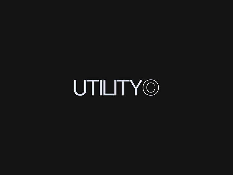
Utility — Wordmark
Client:
Utility
Agency new brand identity
The brief:
This New York-based digital agency work at the cutting edge of tech, including web3. They develop custom mobile apps, platforms and experiences, working with an array of clients, from global brands and media properties to innovative start-ups and funded ventures. As they approached their tenth anniversary, they asked me to create a new identity to celebrate their successful first decade and propel them into the next 10 years. They work with big brands with a tech element, so they wanted a more mature identity that fits who they are now – and will be tomorrow.
How I did it:
I created a strong and luxurious colour palette centred on a powerful black and rich, celebratory purple, cut through with dynamic light elements. I devised a refined logo that has a sense of confidence but won’t conflict with any of the many partner logos that Utility needs to feature. It has a timeless appeal that will serve them well into their second decade. Graphic devices include a 3D glass ring element to represent their dynamic response to client needs and future framing ethos of the brand.
Services:
Art Direction
Visual Identity
Web design
Case study:
See the full works here on Behance.
Follow me:
