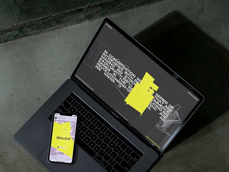
In Conversation With — Website and social
Client:
In Conversation With
Podcast
The brief:
It can be tricky to cut through in the busy world of podcasts. The client needed a flexible identity to stand out from the crowd. The popular podcast features different guests every month, from big brands to e-comms specialists. The show needed a modern, bold typographic identity with the option to strip things back so they could showcase the brand’s logo or photography on selected social assets.
How I did it
‘In Conversation With’ is a monthly series of interviews with retailers who are making big strides in eCommerce. The audience for the podcast is large and diverse, appealing to anyone with an online business looking to evolve and grow. I created a brand identity using two key colours – yellow for energy and purple to signify wealth. The all-important word mark utilised the iconic triple W to indicate the digital format. This was crafted to look like a soundwave to indicate podcasting and the sharing of information. Graphic elements included impactful product cut-outs and bold colour blocking to suggest robust yet level-headed debate. Photography direction included lifestyle and product imagery guidelines.
Services:
Art Direction
Visual Identity
Web design
Case study:
See the full works here on Behance.
Follow me:
