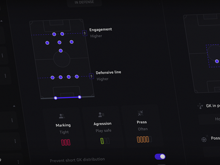
Football Manager - Tactic Screen redesign • Case Study
Hello Dribbblers! 👀
Are any football fans here, or gamers maybe?
Let me introduce you to the first of four chapters of my project - UI/UX Improvement of the Football Manager game.
In need of a designer? Reach out to me
Email - activeek100@gmail.com
Telegram - https://t.me/piotrkadesign
Problem with FM
Some parts of FM have been neglected for too long and would like to receive some love. As a player are not supposed to experiment too much, the choices you can make are very limited and the system that is giving you a feeling of self-agency is shouting midgame. Instead of preparing tactics from a wide set of rules before the match. Meh. Unfortunately, I am not a football tactician therefore unable to invent many various types of instructions that managers can provide to their players.
Due to its difficulty, some of the football fans playerbase choose to play other games rather than try Football Manager. The game feels harsh and unwelcoming, and the entry level is high. I have read many times that someone would like to try the game, but it looks like an Excel simulator and is complex at its core; one does not want to stress while gaming.
Solution
I have designed a system that gives more freedom to the player and placed instructions that are in-game within that new system. The fundamental concept behind my revamp of Football Manager was to make things simpler, give more options to the player while he needs to click and think less, and kick out needless information that is distracting from gameplay core features.
Get involved
My goal is to give the player the exciting feeling of building the tactic from various instructions with deep choices inside it. No black or white decisions but different focus levels of tactic elements.
Visual Improvement
Original Football Manager uses red/green colors to indicate options that the player marked as active or inactive, adding to that realistic green pitch illustrations and colorful dots on it - the interface starts to look like a pack of skittles. I have designed a lot easier to read interface with the addition of vibrant colors.


