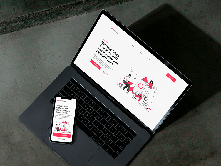
STX.SWISS — Website
Client:
STX.SWISS
Security token exchange
The brief:
The client asked me to produce a timeless identity including a logo that was a visual representation of the company’s purpose. The identity needed to look bold and have a nod to the brand’s Swiss banking roots and the prestige that comes with that. At the same time, it had to look modern and right for the web3 age.
How I did it:
To appeal to the brand’s audience of investors and crypto enthusiasts, as well as everyday people, I created an identity with broad visual appeal. The logo works hard to convey multiple ideas at once. Its quadrants lock together to imply purchasing parts of a larger whole. The bars look like growth charts or real estate viewed from above – it also nods towards the shape and style of micro-circuits. The colour palette relies heavily on a Swiss red along with black to add gravitas. Graphic elements include friendly and accessible illustrations, giving the brand identity a professional yet personal feel.
Services:
Art Direction
Visual Identity
Web design
Case study:
See the full works here on Behance.
Follow me:
