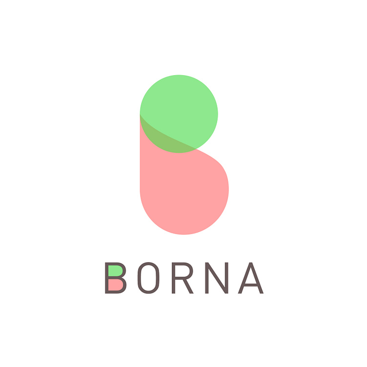
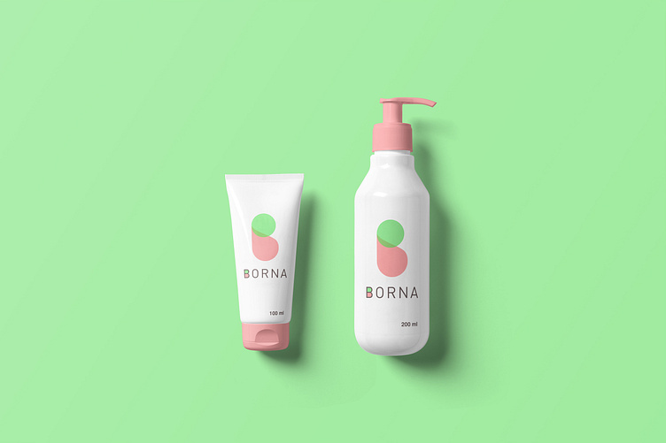
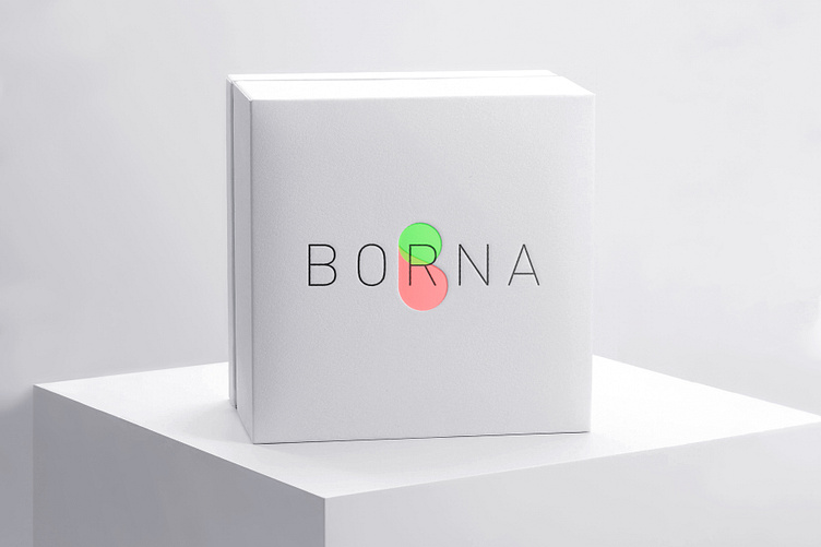
BORNA / Cosmetics company
The logo made from the combination of two forms of circle and drop was obtained. The point that was important to us at the beginning was to create an image feature based on microalgae and the abstract or the result of extraction from microalgae, which the drop represents.
We got the central idea from the heart of this extraction process. In visual language, the drop represents the abstract and the result, and the form we obtained in the search for microalgae was a circle. We made it smaller than the drop to emphasize its smallness, and we made the result, which is the same drop, a little bigger than the simplified form of microalgae.
Finally, the combination of these two shapes, i.e. circle and drop, made the letter B.