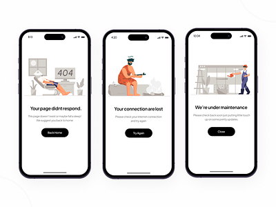
Empty State Illustration
Supp Peeps! 👋🏻
Today i would like to share my exploration about empty state illustration. I used a grayscale color palette in the background to indicate errors or the empty impression of an empty state, and add color to characters to show what happens when nothing can be done in a state. It's kinda sad when you found the empty state, but the illustration will make u feels better when you found it.
Let me know your thought in the comment! If you like what you see, don't forget to leave a Like ❤️
Thank you, and see you later! ✌🏻
See me on Instagram too 👁
________________________________________________________________________________________
Hope you guys enjoy it and press "L" if you like it😉Any feedback or comment? Feel free to leave comments below. Have an amazing project? Send to our email:📧hellopickolab@gmail.com
________________________________________________________________________________________
Services we provide:
• User Interface Design
• UX Research and UX Design
• Illustration Design
• Icon Design
• Website & Mobile Design
• Interaction Design
________________________________________________________________________________________
Our Product on Marketplace:
• UI8
• Uplabs
• Gumroad
________________________________________________________________________________________
Our Social Media:
• Behance


