Daycare app concept
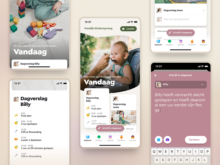
Hi! I used my free time to do a fun restyle of a whitelabel daycare app i frequently use myself. There's a lot that can be improved in this particular app, but for now i mainly focussed on the main diary screen and a new feature: today's story.
Curious to know what you guys think!
Today's story
If you're looking for updates on your child who's at daycare while you're at work, you usually only open the app once you've received a notification about a new post or photo. In the current app, tapping this notification brings you to the homescreen. In this new concept i added a 'story' feature which collects al the photo's and posts from today (or the last day) and presents it as a story to browse through.
Diary
In the current app, the diary shows a regular timeline. The problem I experienced here is that older posts attract as much attention as the newest post which makes it hard to figure out where to look.
The recording below shows a quick view of my concept homepage with a main focus for today, and a more timeline-like view for past days in case you want to look something up.
Let me know what you think or leave some ❤️ in the comments!
Icons are from https://icons8.com/
Stock photo's are from Yan Krukov, Pavel Danilyuk and Cottonbro Studio
