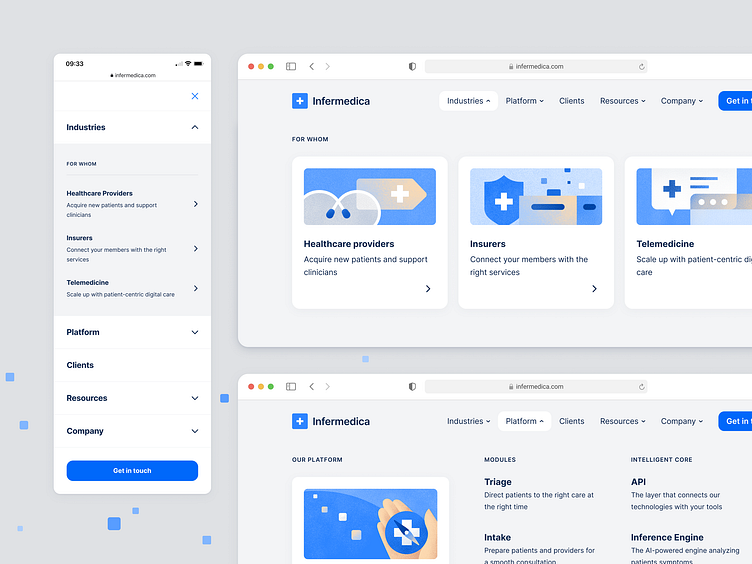
Navigation - header megamenu
Building the new navigation
Infermedica product reached the next level and transitioned into the Medical Guidance Platform. Our digital platform guides patients, clinicians, and administrators toward more meaningful health outcomes - from symptom to outcome.
The new communication required a new approach on our website. Together with the new information architecture, we had to build the navigation from scratch.
I had the pleasure of designing the new website mega menu.
What was challenging in this project was the complexity of the new website architecture and differences in volumes of each menu section.
I've decided to create three types of menu items to show the hierarchy of information and to visually balance the volumes of the individual sections.
Below you will find the website map and screenshots of each section.
Hover and focus states
All menu item types required creating separate hover and focus states. You can take a look at how it was solved below.
Amazing people who also took part in this project:
Aga Więckowska & Magda Kościańska - Illustrators and Communication Designers, who prepared beautiful illustrations
Agata Młodawska – Project Manager
Aleksandra Kwiecień – Product Marketing Lead
Tomek Tuz - Lead of Communication Design
Adrian Czarnous – Front-end development
& many others on the strategic stage.
Feel free to discover our navigation live at infermedica.com.
I would love to hear your opinions :)


