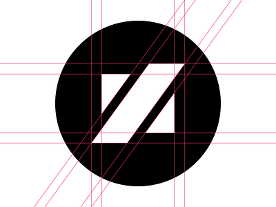
Personal Branding WIP #3
So I had to take a step back from my previous logo attempt as it was way to similar to a logo of a fellow dribbbler. I still want to keep the shapes and the parallel line as it has some personal meaning behind it. SO here is another take and I did try to keep my meaning behind it with steering further away from Jan's logo. I also attached a version without the grid lines.
Here is his profile if you want to check out his Z and his awesome work. @Jan Zabransky
More by Zan Lazarevic View profile
Like

