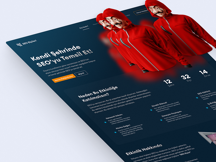
Landing Page UI Design, Web Design for SEO Summit
Hey everyone!
I am happy to share with you the Landing Page design I prepared for a panel & conference site on SEO.
When it was made, it was specially requested to be a La Casa de Papel themed design. That's why there is such an illustration in the hero section.
With a dark-themed design request, a blue-orange toned design suitable for the brand identity was made.
If you like my design, you can show love by pressing "L" <3
Since my customer specifically said that he wanted to collect leads, a multi-step form was made and a FAQ area was positioned right next to it.
You can find the full-size version of the landing page below.
I am available for your exciting projects!
💌 Let's Talk at: egebese@gmail.com
More by Ege Bese View profile
Like


