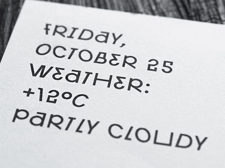
Bipolar Grotesque
The Bipolar Grotesque typeface is part of Richter's brand identity.
Richter — a 5-star hotel, restaurant, bar, library, art gallery and garden all in one. Richter is an independent venue for entrepreneurs, artists, educators, musicians and creative thinkers located in an old mansion.
The contrast between the old context and the new content became the main idea behind the identity. We tried to merge these two worlds together using fragments of the mural found in the old interiors of the house and the quirky custom font called Bipolar Grotesque.
Each of its characters has an alternative, which allows for countless possible combinations. The typeface is eclectic, unpolished, and raw, perfectly capturing the energy of the Richter space.
Some characters are rotated or mirrored to render others. This way, S creates 5, W turns into M, and E becomes 3.
Follow ESH gruppa to learn more about our work:
| ESH gruppa | Instagram | Behance | LinkedIn | Twitter | Pinterest |
