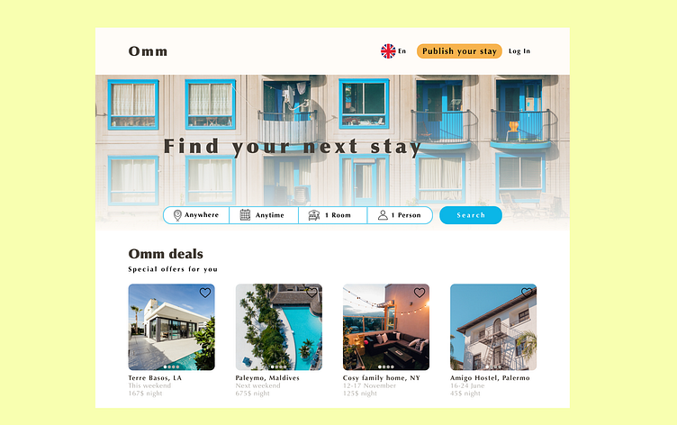
Booking website landing page
Omm home & hotel stays
The landing page design for 'Omm' home & hotel stays was created after an analysis of industry competitor giants Booking.com and Airbnb.
Airbnb's landing page consisted of experience listings as well as home & hotel stays. This was because Airbnb had a different business model than ordinary bookers. However, Airbnb also had one of the cleanest and easy-to-navigate landing pages. That's why I appreciate Airbnb's branding through design. I decided to exclude experiences from my landing page.
Booking.com's landing page has a traditional layout and design. However, they maximized the benefit of the search bar by integrating a multiple search option. In this way, the user can search for specific qualifications before the filtration process. It lists specific answers in a short time.
Then, I used this case study to identify the qualifications I will put in the search bar. These qualifications are most relevant to user when associating the offer with the price. I put place, time, room, and persons as search criteria to be specified.
Hi! This is my design journal.
I’d love to hear from you, why don’t you message me on LinkedIn, or through email?
Let’s connect : )🤙🐒
september@uni.minerva.edu
