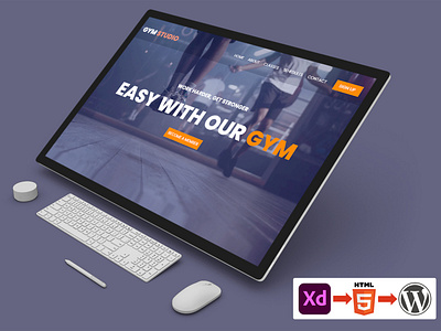
GYM STUDIO WEBSITE DESIGN
"Get your workout gear ready!"
We’re thrilled to introduce you to our latest exploration of Gymmer - The GYM Studio Website.
The design of a fitness website requires careful consideration so that users can easily find information relevant to their goals, whether they be losing weight, building muscle, or following a customized exercise regimen. The website should also have great design elements that add whimsy to motivate visitors toward their fitness goals.
The landing page’s UI is the result of our efforts, and it features a unified color scheme and careful attention to balance. We went for a modern aesthetic by employing subtle gradients and a well-organized arrangement of content to grab the user’s attention.
Gymmer stands apart from the rest. Gymmer works like a website that lets users "pick their own experience," allowing them to establish their own goals and interests.
The website’s minimalist design makes it an excellent, not-at-all-overwhelming home for a myriad of wellness-related features.
What do you think of this design? Press❤ "L" if you like it.
Tools: Adobe XD & Adobe Illustrator
Let’s design your thoughts👋 Visit Us - www.codingscript.net
