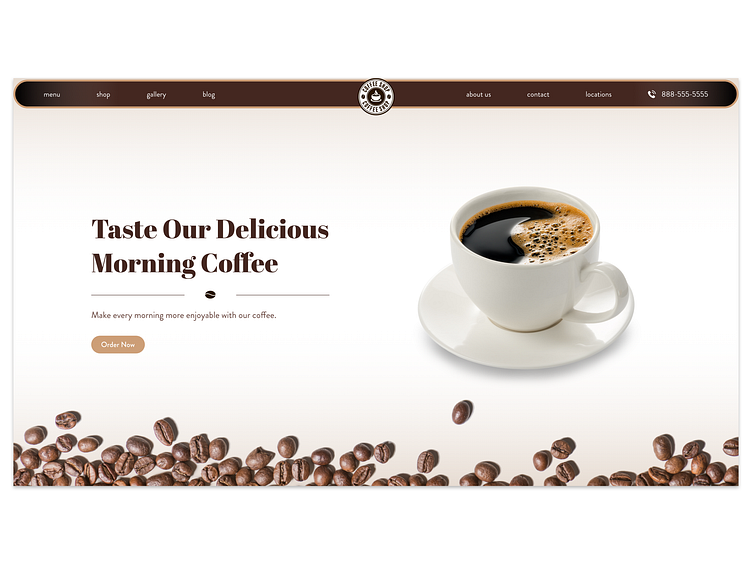
Daily UI Challenge #3
Hello Everyone :)
I finished my next UI challenge. It's an above the fold of a coffee shop landing page.
Since 99% of the coffee shop websites use dark and brown backgrounds and pictures, so I decided to use a light, white background. It's always a good idea to be different from the competitors. That's what I tried to show it here.
I could design the whole web page, but I stopped at the above the fold since it would have taken much more time to design the entire page.
Maybe I'll come back later to this challenge and design the whole page.
By the way, I quite like these challenges and will try to post my next one this week too.
You can also watch a video on how I created this. Check the link below.
Stay tuned and follow me!
Work inquiry: hello@websiteultra.com
Website Ultra | Instagram | TikTok | Behance | Facebook
