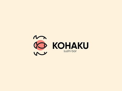
KOHAKU - Brand Identity
A new logo I have created for a sushi bar. 🍣
I wanted a clean and minimal logo with a clean typeface to match. This makes it modern and clean giving it a very modern look with a colour scheme that complements this.
If you like my work please check out my other social medias.
Socials & Website
https://www.behance.net/reecesimmons
https://www.instagram.com/reecesimmonsdesigns/
More by Reece Simmons View profile
Like
