Moorprint 3
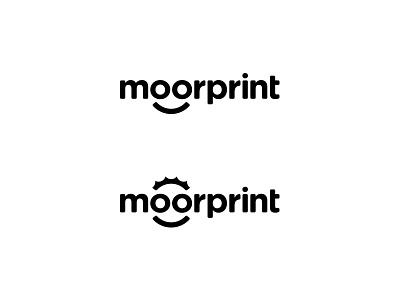
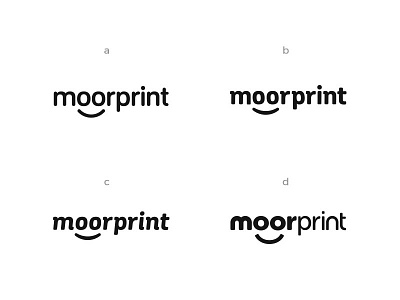
Couple of other options... bottom one features an addition at the top. The company want to be known particularly for their friendly client service and so sunshine was a theme I investigated a bit earlier. It's also reminiscent of a sunrise over Dartmoor (where they get their name) and looks a little like hair over the face (they currently have a little guy as a 'logo'/mascot character so this might help the transition from the old to the new).
That said, it might be unnecessary, distracting or too similar to a cog or even the printing.com logo. Hmm. Thoughts most welcome.
More by Owen Jones View profile
Like

