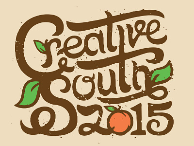
Creative South 2015 Type
Textured type to go with my peaches for the Creative South 2015 poster. As much as it kills me to have inconsistencies with the lettering I definitely think it helps give it that vintage hand painted look. Kinda like someone had one shot at it and that's what came out.
More by Tron Burgundy View profile
Like
