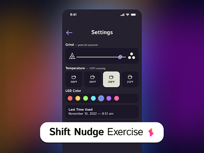
Settings View for Smart Coffee Cup and Grinder System
Hey everyone, I tried to go with some iconography to design this coffee cup settings view. Exercise from Shift Nudge.
The white used is taken from Corvus Coffee Roasters' branding in Denver. The level of control I offered to the user were finite and specific along the lines of what Notion does with their color options. (Choosing finite over a spectrum of infinite options is also friendly to the hardware guys designing and testing their coffee cup!).
HIG's Title 1 was used for the top header.
HIG's Body was used for labeling each field
HIG's Footnote size was used for the temperature options. Italics used for feedback of current temperature and applications of grind size.
Would love feedback on ways to improve support of dark mode for accessibility.
