Left or right
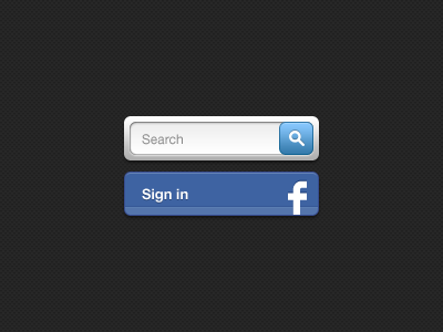
I figured it out. Search will be on top. I also removed the stroke from the Sign in button (thanx Jord!) for more crispness and inverted the drop shadow so it matches the navigation.
Next dillema. Should the sign in button be on top of the navigation (left) or beneath it (right)?
Worth mentioning: signing in is not huge for this website. It just grants you to comment on articles.
More by David Notté View profile
Like


