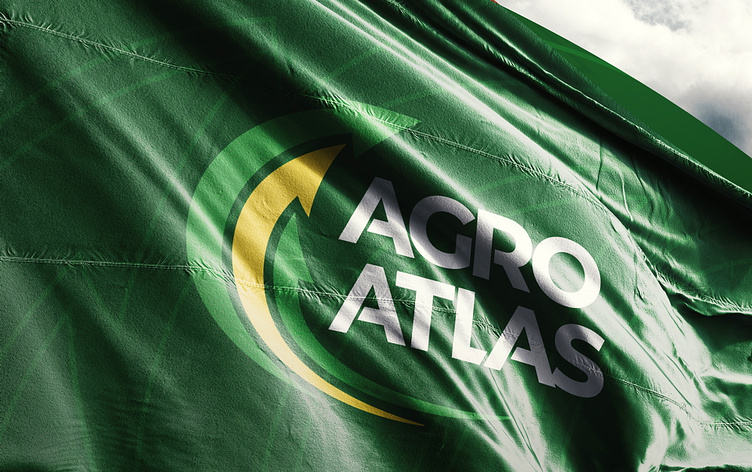
Logo restyling for AGRO-ATLAS
The company sells and services agricultural machinery, mainly John Deere. The own production of spare parts is also developing. The task is to make the logo more modern, but at the same time maintain recognition.
As you can see below, the old company logo lacks style and is overloaded with graphic and text elements. The text part is practically unreadable when zoomed out.
The updated version, in accordance with the task, preserves the color scheme, recognizability and meanings, but at the same time it looks much lighter, more original, and becomes practical for use in offline and web environments.
Watch the animation of the new logo here:
Are you interested in knowing the cost of this project? Write in a comment and I will answer in a private message.


