Multiple Value Axes Reporting
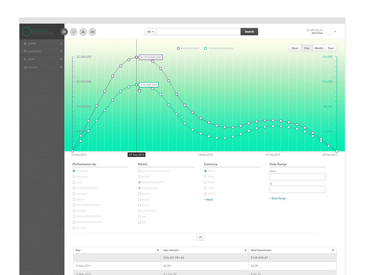
This is a multiple value axes chart that makes it easy to compare to sets of data that would usually not provide any visual distinction on one x axis... so thats why there are two!
The design was created for a company in a highly competitive industry so I had to take some of the content. I hope it still translates : )
Press ( L ) if your into it!
