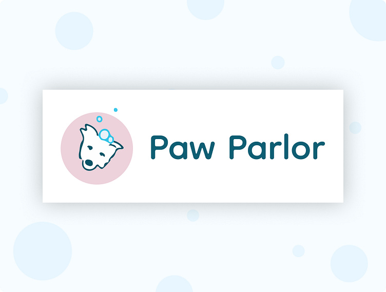
Dog Grooming logo
This case study focuses on my process completing the Dribbble Weekly Warmup - design a modern logo for a new dog grooming service.
Initial framing
For this exercise, I set a few assumptions for Paw Parlor, a fictional dog grooming business:
Let's assume they want to appeal to customers of all ages
Let's emphasize playfulness, color, and the dogs themselves
Visual competitive analysis
I reviewed the visual styles of 3 comparable dog grooming businesses to understand how they used visual hierarchy, imagery, color, typography, and branding to position themselves in the market.
This analysis provided one form of inspiration for Paw Parlor: it could visually differentiate itself through a simple, playful logo that focuses on dogs.
Dog-o-Mat
Visual hierarchy and logo
Landing page emphasizes reviews and customer service
Logo subtly references dogs through paw prints, but mainly features a weighty serif typeface
Imagery
Focuses mainly on photographs, featuring both a groomer and a dog
Iconography is a mixture of outlined and filled icons
Color
Dark, rich, warm colors
Typography
Source Sans Pro
Bark Boutique
Visual hierarchy and logo
Landing page emphasizes services
Logo is quite complex, featuring a dog, a refined typeface, and an elaborate border
Imagery
Focuses mainly on photographs; several are grooming-related, while others are not
Limited iconography
Color
Saturated and bright colors
Typography
Dancing Script (titles) and Gentium Basic (body), which both suggest luxury and refinement
The Groom Room
Visual hierarchy and logo
Landing page emphasizes an overview and details about the business (location, floor plan, etc.)
Logo doesn't reference dogs, but typeface suggests informality
Imagery
Limited, focusing on the shop and staff
Limited iconography
Color
Saturated and bright colors
Typography
Lobster (title & logo) and Arial (body), which suggest informality but don't pair well together
Word Map
Following the visual competitive analysis, I created a word map. In this exercise, a designer starts with a set of initial words, and free associates from there.
Word mapping is especially effective because it uncovers related and potentially unexpected themes, inspiring thoughtful and imaginative visuals.
The words I brought forward from this exercise were play bow, wag, and bubbles.
Initial draft
A dog's play bow truly represents playfulness, so I started there. I hand drew two dogs, incorporating bubbles and experimenting with simple color and line weight.
I chose a type face that matched the illustration's line weight and featured the same casual and playful energy.
Critique & evolving the design
I shared the first draft and intentions with designer colleagues, and our conversation surfaced a few points of thoughtful critique:
The pug illustration may not scale down effectively
Framing the illustration can help to push the logo forward, and introduce an opportunity for more color
There are opportunities to adjust the kerning and general treatment of the typeface (for example, connecting letters), or explore a typeface that isn't handwritten
Finalization
I evolved the logo from there, simplifying so that it scaled down successfully. I kept her head tilt and introduced additional color to maintain the playful theme, and opted for a non-handwritten typeface so they illustration could shine.


