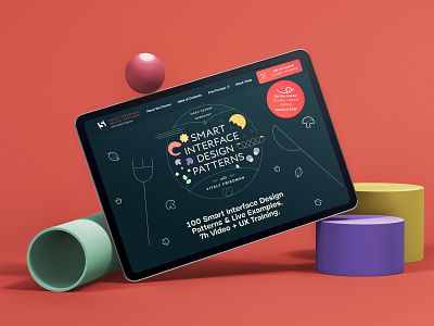
Smart Interface Design Patterns: the landing page
For the landing page design of the course Smart Interface Design Patterns, Vitaly Friedman (founder of Smashing Magazine) requested that the interface should feel like a part of the Smashing Magazine brand.
This meant that part of the UI (fonts, buttons and forms) already used on the leading platform would be seamlessly integrated into the course website.
After reviewing the material he shared with me, I couldn't help but notice that all of the videos had been recorded in a beautiful kitchen, and that each course opened with a handwritten title on a blackboard.
I liked this setting, and felt that I could smartly develop a beautiful story using the kitchen as a metaphor.
I kept the dark colour of the blackboard, on which the entire story takes place. Then I imagined each video as a ‘recipe’, packed with useful advice and examples (aka, ingredients!) knowledgeably presented by the master ‘web-chef’, Vitaly Friedman.
