Package Redesign for Funky Sancks
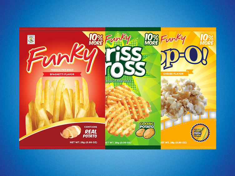
Packaging studies for Funky, Criss Cross and Pop-O.
Basically, I wanted to highlight what they are selling by making the product shots bigger. I also tweaked their old logos, adding a thick outline and tightening up elements to make it look crisper. I used gradients and played around with foil effects so that the packaging would pop out more when displayed in the store shelves.
For freelance work contact me at carloasanjose@gmail.com
