Logo Project Carclean


Creating a logo for a car wash company
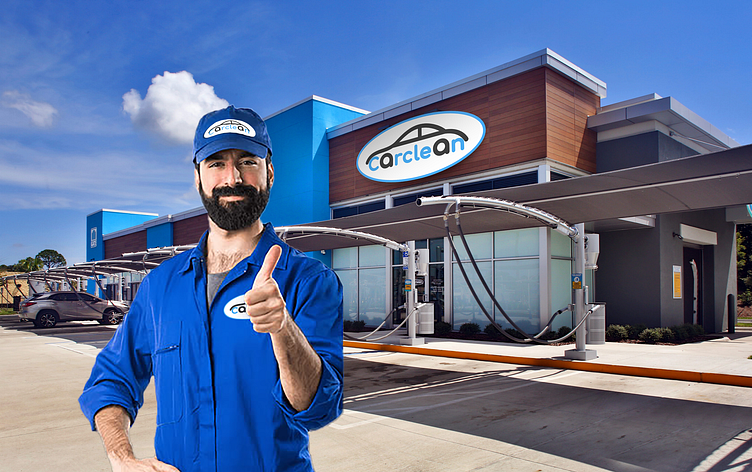
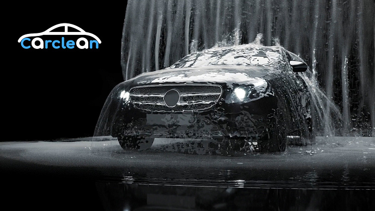
The client from Ohio just opened their second car wash and wanted a more attractive logo for their company. His only requirement was; the logo should contain a car and one should recognize at first glance that it is a car wash. First I made some sketches and tried to combine the outline of a car and the writing. I just juggled a bit with these two aspects until I came up with the idea of using the two "a" from Carclean as the wheels for the car and incorporating the rest of the typography.

I chose the colors blue and dark gray. Blue symbolizes purity and cleanness, like the clear sky or the ocean. Just two colors to keep the whole thing simple and concise, and the car’s minimalist shape gives it solid recognition.
Lets work together!