Softeta
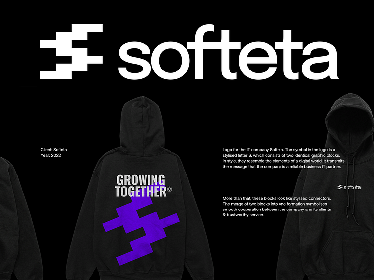
Logo for the IT company Softeta. The symbol in the logo is a stylised letter S, which consists of two identical graphic blocks. In style, they resemble the elements of a digital world. It transmits the message that the company is a reliable business IT partner.
More than that, these blocks look like stylised connectors. The merge of two blocks into one formation symbolises smooth cooperation between the company and its clients & trustworthy service.
More by younique View profile
Like


