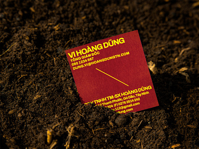
Hoang Dung name card | by xolve branding
Our design team also employed a contrasting, eye-catching use of colour for the new visual system. A warm, vivid colour palette of red and yellow forms the primary brand hues, while colder and more neutral tones like green, purple, blue, and grey act as complementary colours. Archivo is the primary brand typeface. Working in harmony with other graphic elements, it conveys a balance of modernity, trustworthiness and subtle confidence.
Full case study - http://www.xolvebranding.com/work/phan-bon-hoang-dung/
More case study - http://www.xolvebranding.com/works/
More by xolve branding View profile
Like
