Company Profile Website Design
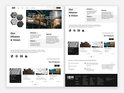
This is an exploration of my design for the user interface of the company profile website. Combination of white and black colors to make the website look clean and elegant, the information is presented in a minimalist way but still conveys sufficient information, the Monserrat font combination makes the website look more aesthetic and firm, every product and content will be presented neatly and minimalist so that it is easy to understand by users and so that the website looks comfortable when used to attract the attention of customers.
Feel free to leave your feedback :)
Connect with me: alviyantoruri@gmail.com
More by Masruri Farid View profile
Like
