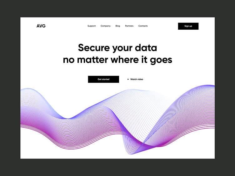
Landing Page for Cybersecurity Company
💌 Have a project idea? We are available for new projects!
hello@ronasit.com | Telegram | WhatsApp | Website
A website helps companies create brand awareness and showcase their brand to potential customers. As websites are an important part of brand promotion, we have decided to present our vision of a corporate site.
In the upper part of the page, there is a service motto, a list of the company’s partners, and a list of products provided by the company. Below, there are reviews from the clients and a form.
Numerous blue and purple elements in combination with a neutral color scheme make the interface look hi-tech and sleek. The minimal design and clear layout help users to concentrate on the content.
Our designers chose a neutral black-and-white color scheme to make the information on the page easier to read. They also accented the main UI element with blue and purple to help users navigate through the page more quickly.


