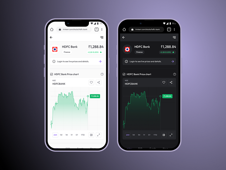
Stocks Page UI | Trinkerr | FinTech
Hola Beautiful people! 👋
Here is my latest case-study on a "stocks page" for a FinTech platform. With this app, you can invest in various national "stocks", connect with seasoned investors seamlessly to get better insights to empower your investment journey. What do you feel about the calm "peaceful" color-system? I'm using a 4px soft grid approach and a 4X spacing-system.
Let me know if you like it, please press "L" to support the shot; it boosts my motivation levels 😉💖
Thank you for your time and attention.
Follow me if you like the effort here :)
See you soon, Peace. ☮️
Yours Akshay
More by Akshay Hooda View profile
Like

