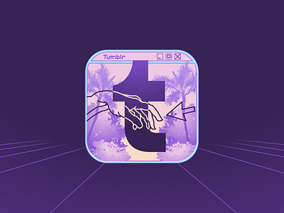
Tumblr App Icon Redesign
Hello!
Here is my rebound to the Tumblr app icon redesign.
I tried to think along the lines of old internet energy and artistic view.
Here you can see an old cyberpunk theme color palette.
I tried to make use of the Tumblr icon square base by making it into an old Windows 7 pop up type of vibe. The Tumblr 't' seems to be popping out of this dialogue box and achieves the main focus. There is a lot of gradient work because earlier gradients were in fashion.
The title of the dialogue box is "Tumblr" written in New Glitch Demo font.
There is a line painting in the middle inspired from the famous painting Creation of Adam. Here, instead of the hand of God, the human (Adam) is shown about to touch a cursor signifying how Tumblr connected so many people together to the world of internet.
The background is made of one point perspective lines, with a gradient to accentuate the feeling of depth.
I used Figma to make this.
Hope you like it <3
Email: nicktrip9@gmail.com

