GoTravel Logo Design
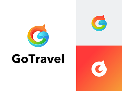
Shape: letter G.
The fire edge on the right represents praise, encouragement, and high quality service;
The whole shape is the initials of hot rolling, which is also the meaning of GO, representing go travel;
The whole shape is similar to that of a dragon, symbolizing China's broad culture;
The whole shape finally gathers at the end of G, which means that a group of people with dreams and passion get together to provide customers with a high-quality travel experience;
It also means that users get together with good friends and feel the joy of traveling.
Color: Passionate red and green represent nature and vigor, and blue is ocean waves, which also means hot.
More by DAO UI Design Studio View profile
Like
