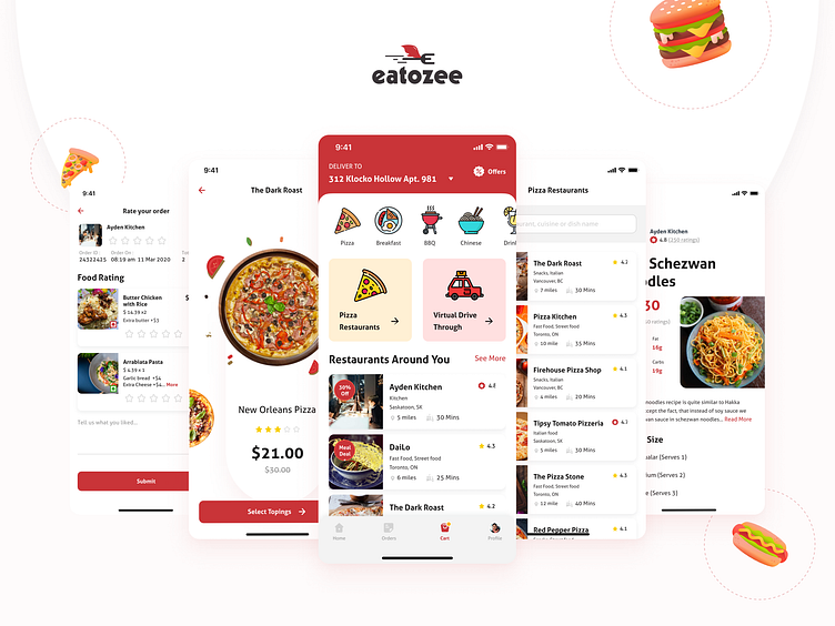
Eatozee App
The app helps you to get the best food quickly in time from the restaurants across the cities.
Project Overview
Eatozee is a food delivery mobile application that provides users to order food, review and search for their favorite food and partnered restaurants in Canada. It has the unique feature of providing the facility to order and pay bills inside restaurants without a waiter, creating an amazing dine-in & dine-out experience.
🧗Challenge
The online food industry is getting huge every day and there are tonnes of online food delivery apps available in the market. So, the challenge was to make eatozee stand out from all the apps already available and make it user-friendly, easy to use and by solving all the pain points that customers have by going the extra mile which is usually ignored by many the online food ordering platforms.
💡Solution
The factors contributing to the popularity of online food ordering were: lack of time to prepare food, access to multiple restaurants and cuisines with a couple of clicks, inviting offers, rewards, and cashback. This led us to think about developing a platform that provides not only the basic online food ordering service but also enhances it by including an amazing dine-in and out experience and giving various takeaway options.
🎯 Goal
To create an application that combines 3 platforms for customers, restaurant owners, and riders which combines and serves the needs of all three in order to increase sales of the restaurant owners, provide the convenience of various choices to order in/ take away, and an employment opportunity for the rider. The goal is to add distinctive features of providing customized timings to open/ close restaurants, dine in/out and make payment from the app including its intuitive design using ergonomics and user-friendly interface.
Project Timeline
User Personas
Features competitive analysis
Color Palette
User's Journey Map
Wireframing
Wireframing is a vital UX process as it helps visualize the entire feel and look of the app and makes sure every aspect and page is according to the brief and easier for the user. Hence, this step requires designing simple yet intuitive wireframes to give the best possible navigation.
Home Page
This is the first screen of this app where users will be able to see all the meal categories that they can order easily and also a user friendly navigation which will help them to explore all the other pages.
User Interface
What do you guys think? Let me know in the comments section.
Hope you ❤️ this.
Your feedback 💬 and appreciation are always welcome.
Press “L” if you love it.
Wanna collaborate with us? Shoot your business inquiry at design@indianic.com


