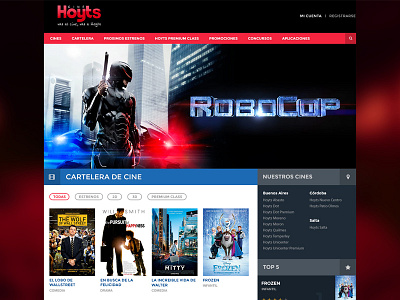
Hoyts Redesign
This is an old (and incomplete) redesign I made just for fun.
I love watching movies in a cinema. For me, all movies should be seen in a cinema.
My favorite movie theater here in Buenos Aires is called Hoyts.
Which is a great cinema but their website is really bad, in design and UX.
http://www.hoyts.com.ar
If you want to buy a ticket you have to do endless clicks to get it. Even searching movies is difficult.
So I made a clean and usable approach using my experience as a regular user and what I think is best for customers.
The design is not complete as you can see because I dropped it but here it is anyway :)
More by Nico Andrade View profile
Like


